Palatable Palettes

The color obsession continues! We’ve looked at color once or twice before, and it seemed to me I’m long overdue for another glance. Autumn has arrived* and with it a change in popular tones, from the cool brights of summer to the warmer jewel tones of calendar-perfect New England fall foliage.

The crystal-ball-wielding wizards at Pantone told the world what we’d be wearing (and decorating with, and even eating) this fall:

Screen Shot 2017-09-10 at 10.22.17 AM
Image credit: Pantone

Well hello, familiar faces. That Millennial Pink and Blue look an awful lot like 2016’s co-colors of the year, Quartz and Serenity. Both pastels are certainly the least seasonal of the bunch, but their popularity can’t be denied.

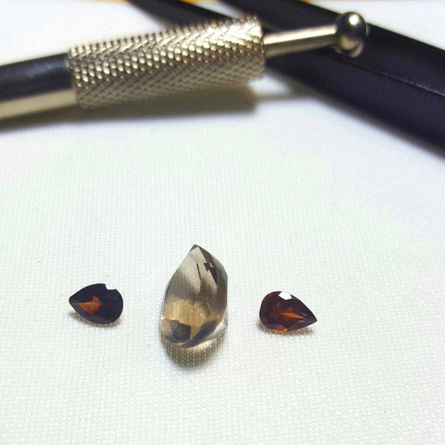
My personal wardrobe tends to favor tones similar to the blueish-green Shaded Spruce, cold oceanic Navy Peony (what? navy peonies?), and the ever reliable Neutral Gray. But recently, thanks in part to some recent exposure to a delectable suite of fire opal and Imperial topaz, I’ve been contemplating rich and flamelike palette that includes Autumn Maple and Tawny Port, with a little Butterum for good measure. I blame my seasonal affinity for foods in those colors. Mmmmm, caramel…

Alas, for me, Grenadine is too garish and Golden Lime too sallow. Blame it on the blonde.

Taken as a whole, the palette seems incoherent and vaguely messy, with little harmony or pleasant relationship between colors. It’s almost as though each swatch was selected by one person as a fall favorite, and the whole lot was jumbled together with no regard for complementary hues. Individually the shades are lovely; collectively they’re a distraction.

Keep your eyes open for more examples of these colors as we head deeper into the season. Right now I think it’s time to bake another apple cake and get those cider & sea salt caramels wrapped up. Beef stew, anyone?


*It’s September folks, and I’ve already gone apple picking. The best season has begun, and I’m not sorry.

#Pantone and the Color Bubble

It’s that time of year once again: Pantone, the arbiter of all things color, has announced their pick for the 2017 Color of the Year. Say hello to Greenery:

pantone-color-of-the-year-lee-eiseman-quote
Image from Pantone press release

Referring to the shade as “nature’s neutral,” Pantone has obviously decided to highlight a color that plays to the middle of the road, inciting very little in the way of strong opinions and offensive to essentially no one.

It’s a safe color. It’s pretty, in an I-don’t-want-to-admit-I-hate-peridot kind of way. It’s lush, verdant, and full of springlike innocence. It looks good with pink. Legions of Lilly Pulitzer ladies* will rejoice.

But is it what we want? Is it even what we need?

I’ll be honest, I was hoping for something a bit more… bold. After last year’s double-pastel campaign, I felt reasonably certain that the next choice would be something I could sink my teeth into. Some pizzaz, some pop, something worthy of a coming year that’s sure to be full of fireworks. Perhaps, dare I say it, a color that would signify the rising swell of strong emotions in the hearts of millions, encouraging us to keep fighting the good fight.

How disappointing.

Now there is something to be said for the nice concepts that Greenery is intended to represent; as an active environmentalist, I certainly can’t argue with the purported message. But according to Pantone, the Color of the Year is supposed to provide

“A symbolic color selection; a color snapshot of what we see taking place in our global culture that serves as an expression of a mood and an attitude.”

Calming, soothing, spa-like green is decidedly not the mood I’m sensing, at least here in the US and in most of the EU. So, what comforting little bubble is Pantone living in? How do they, as a company and collective body, manage to find a hue so incredibly inoffensive that it actually becomes even more of a statement in its own banality?

The tree of the fashion industry, with its many branches — jewelry, accessories, couture, high and low fashion, etc. — might be in full leaf, but I don’t think that needs to be taken quite to literally. Maybe this color will grow on me, and may bring about some interesting interpretations when blocked with bold black and white, or warmed up with some shiny yellow gold. For now, it feels like a good excuse to take a nap.

Whatever they’re doing to reach that level of Zen, I wouldn’t mind borrowing a dose or two. I might need it this year.


*I confess to wearing a bit of Lilly now and again, but c’mon people. If you don’t live in Hawaii or Key West, how is this color relevant for more than 2 months of the year?

Spring Sneak Peak

If it’s September, it must be… the favorite month of those with haute couture appetites, the global sequence of ____ Fashion Week. It’s a time to reflect on the trends of years past, and glimpse the outlines of what we (the little people) will be wearing once the snow melts about 8 months from now. I talk a lot about color here, have you noticed?

As much as I’d enjoy writing post after post about the clothing that graced the runways this year, I’m content instead to contemplate a broader palette — literally. Colossal colorateur** Pantone has once again released its preview of the Spring 2017 colors, and I couldn’t be more excited for the opportunities they present for the fashion, jewelry, and decorating worlds.

Pantone refers to the collection as, “a mixture of vitality, relaxation and the great outdoors.” I’d call them bold, vivid even, and they complement and contrast all day long. There’s something for everyone: bright pops of pink, yellow, and orange; softer notes of blues and greens, and a touch of appealing neutrals that ground the whole collection.

Fortunately for the gem world, nearly every choice has a corresponding gemstone or two to match:

screen-shot-2016-09-26-at-8-09-03-am

Niagara can be found in star sapphire or moonstone, Primrose Yellow in yellow sapphire, Lapis Blue is lapis, of course, and Flame is an obvious fire opal. Pink Yarrow seems to be Rhodolite garnet, Island Paradise an aquamarine, and Greenery is peridot. Pale Dogwood proves the popularity of Morganite once again, Hazelnut could be found in cognac diamonds, and Kale captures the unusual green sapphire.

You would find a good number of these colors in my own wardrobe, which (when I’m not wearing black, anyway) is often a balance between saturated jewel tones and cozy neutrals. What’s old is new again, as they say, and Pantone deliberately attempted to reinvent and revitalize our world with fresh updates on the familiar.

I’m a little disappointed at the few missing pieces — no true red of any kind, no eggplant or plum, and no grey to be found. Blue is my favorite color, but did we really need three? And for many, the difference between Pale Dogwood and Hazelnut is only a matter of degree. Eliminating a few of these as redundant would have left room for a more well-rounded group.

But overall, I’m satisfied with the direction and selection. It will be interesting to see which color comes out on top — Niagara is supposedly the leader of the pack, but the court of public opinion doesn’t always agree — and how the palette plays out in ready-to-wear and street fashion.

These are the colors we live in. What do you think about them?


**Yes, I made that up. Sounds sexy though, doesn’t it?

Pantone Says What?!

Well, they’ve done it again. The authority on all things color, Pantone has caused a minor stir in the fashion and design world be releasing a pair of complementary hues for their latest iteration of Color(s) of the Year.

I must have made my mild obsession with color pretty clear, because I’ve already received a handful of messages asking my opinion on the concept (how flattering!). My first thought? “Well, duh.”

That’s not to say I could have predicted the exact colors Pantone would select (unlike some wizards who apparently could), but people have been clamoring for the softer and warmer tones for some time now — you might have heard of the resurgence of rose gold, for example. So I’m totally on board with Quartz.

Serenity, on the other hand, is a tougher sell for me. Not the color itself — my favorite color is blue, after all — but the indication that little miss quartz needs a co-star at all.

Sure, I understand the balanced-genderized-color-tone argument. And the colors swirl together in a very graceful, artistic way, which will be seen as a godsend for the fashion world after the struggles with last year’s color, Marsala. But I would have liked to see Quartz stand alone, to prove that the consumer world can handle a pastel in all its quiet, refined glory.

Nonetheless, prepare thyselves for an even greater influx of all things morganite and moonstone. They’re beautiful, easy to style, and they’re here to stay.


Travel the World, Pantone Style

Remember when I wouldn’t stop talking about color, and you thought my posts would never end? Well, you were right. But with the latest announcement of 210 new colors from Pantone, the Be-All-End-All Final Word on All Things Color (or so they seem to claim), can you blame me?

Of the approximately 10 million colors the human eye can see, the 52-year-old company has named, numbered, printed, collated, and collected a total of 2,310 colors including the newest additions. A drop in the proverbial bucket to be sure, but impressive when you consider the level of standardization they must achieve in order to standardize these colors. The highly consumable formats — cards, swatches, folders, books, etc. — are used by fashion and interior designers (and many others) to quickly and accurately describe colors.

Many of the new shades are intensified versions of familiar faces, with major expansion in the pink and orange categories. I sense a lean toward the exotic, with lots of richness and food-relevant hues that play well both with each other and as standouts with a neutral. Credit is given to the worldly and well-traveled Pantone creative team — and they do indeed spend time in countries around the globe, noting the color trends in food, fashion, and even technology. However, I’d like to think that a more globalized palette is simply long overdue in such a connected and visually-focused age. These beautiful new additions simply reflect a more complete view of the world as we see it.

As a kid who came of age in what I call the Crayola era, I grew up surrounded by such delicious-sounding color names as “macaroni and cheese”, “wild blue yonder”, and “razzmatazz”. Anything called “pink flamingo” or “fuzzy wuzzy” was just irresistible to me, and I pleaded for box after specialty box as much for the creative names as the vivid colors and gently pointed tips each new set would bring. The colors could transport me to favorite book settings and faraway places long before I later traveled there myself.

These days, the Pantone colors will set you back a bit more than your average ten-year-old’s allowance. It’s worth noting that these two prismatic powerhouses have never officially collaborated, though many color-savvy stylists will often reference both names of a similar color in order to evoke just the right shade. But perhaps, like a page from a coloring book, this newly-expanded array of colors will carry you away to a favorite childhood memory… or even a whole new destination, right from the comfort of your living room.

Color Me Wild: An Ode to the Bold and Bright

As a child growing up just outside of Boston, one of my favorite places to visit was the Museum of Science. What kid doesn’t love to watch lightning strike indoors, make music by walking a staircase, or explore the world of prehistoric creatures? But one of my favorite exhibits was on an upper floor down a lesser-known hallway, tucked inside an area designated for learning about the way the human body works. Anatomy and physiology were never my strong suits, but a display dedicated to color, scale, perception, and the human eye-brain function never ceased to amaze me. From optical illusions to swatch-matching, I couldn’t get enough.

(As anecdotal evidence of my passion, I memorized every color in my Crayola crayon box by age 10. How else would an elementary school student know how to spell — and pronounce — cerulean?)

It’s unsurprising, then, that I’ve always had a particular love of color and design. I tormented my own mother after discovering her partial colorblindness (just the color green, strangely enough) but redeemed myself by always helping her select coordinated outfits and even picking the paint color for my parents’ new kitchen.

It follows, then, that the study of colored gems in particular leads to a rather in-depth look at color and a specialized vocabulary not found among the crayons. Fashion and lifestyle brands are now heavily influenced by the renowned Pantone Color Institute, which both maintains accurate and reliable color swatching and attempts to predict (or rather, set) each season’s feature color and palette. This has an interesting side effect: some businesses hop aboard the trendy train, embracing each new color and promoting its use in everything from home decor to nail polish. Others will purposefully split from the popularized palettes, choosing instead to pursue a kind of counter-culture aesthetic instead.

The result of this new focus on color seems to be, primarily, a lot more of it. Wildly color-and-pattern-centric classic brands such as Vera Bradley and Lilly Pulitzer are back in the spotlight, with the latter about to debut its first mass-market collaboration with Target (the brand follows other bright and bold names such as Missoni). While monochromatic styles will likely never be a thing of the past, it does seem that more colorful plumage and the self-expression it brings has moved to the forefront.

Where does this leave me? My little Yankee heart will always have room for the classic, tailored lines of seaside, citified, prep-school standards like khaki and navy. But my lifelong appreciation for color feels right at home in an industry dedicated to the beautiful, creative combination of every color under the sun, so this little dove feels more than ready for some finer — brighter — feathers.