Spring Sneak Peak

If it’s September, it must be… the favorite month of those with haute couture appetites, the global sequence of ____ Fashion Week. It’s a time to reflect on the trends of years past, and glimpse the outlines of what we (the little people) will be wearing once the snow melts about 8 months from now. I talk a lot about color here, have you noticed?

As much as I’d enjoy writing post after post about the clothing that graced the runways this year, I’m content instead to contemplate a broader palette — literally. Colossal colorateur** Pantone has once again released its preview of the Spring 2017 colors, and I couldn’t be more excited for the opportunities they present for the fashion, jewelry, and decorating worlds.

Pantone refers to the collection as, “a mixture of vitality, relaxation and the great outdoors.” I’d call them bold, vivid even, and they complement and contrast all day long. There’s something for everyone: bright pops of pink, yellow, and orange; softer notes of blues and greens, and a touch of appealing neutrals that ground the whole collection.

Fortunately for the gem world, nearly every choice has a corresponding gemstone or two to match:

screen-shot-2016-09-26-at-8-09-03-am

Niagara can be found in star sapphire or moonstone, Primrose Yellow in yellow sapphire, Lapis Blue is lapis, of course, and Flame is an obvious fire opal. Pink Yarrow seems to be Rhodolite garnet, Island Paradise an aquamarine, and Greenery is peridot. Pale Dogwood proves the popularity of Morganite once again, Hazelnut could be found in cognac diamonds, and Kale captures the unusual green sapphire.

You would find a good number of these colors in my own wardrobe, which (when I’m not wearing black, anyway) is often a balance between saturated jewel tones and cozy neutrals. What’s old is new again, as they say, and Pantone deliberately attempted to reinvent and revitalize our world with fresh updates on the familiar.

I’m a little disappointed at the few missing pieces — no true red of any kind, no eggplant or plum, and no grey to be found. Blue is my favorite color, but did we really need three? And for many, the difference between Pale Dogwood and Hazelnut is only a matter of degree. Eliminating a few of these as redundant would have left room for a more well-rounded group.

But overall, I’m satisfied with the direction and selection. It will be interesting to see which color comes out on top — Niagara is supposedly the leader of the pack, but the court of public opinion doesn’t always agree — and how the palette plays out in ready-to-wear and street fashion.

These are the colors we live in. What do you think about them?


**Yes, I made that up. Sounds sexy though, doesn’t it?

Two Become One: It’s Complicated

Comfy sofa. Popcorn. TV remote. Pen and paper (sometimes low tech is still best). Wine. Lots of wine.

I was prepared to feel a lot of things while watching the Met Gala this year, but disappointment wasn’t on the list.

As I mentioned earlier, I anticipated an evening in which the tastemakers du jour would embrace their clever, creative, and progressive sides. There were some unique moments, to be sure, but the overwhelming theme of I-don’t-get-the-theme-and-neither-does-my-stylist-but-tech-is-shiny-so-I’ll-wear-metallic was surprisingly dull after the first half hour.

As Wendy Brandes put it in her own recap, “Who knew that robot-style could get old?”

Nonetheless, I selected two standouts that deserve some attention.

First, behold the literal Cinderella of the evening, Claire Danes, whose Zac Posen gown embraced the femininity of classic ball styling and added a twist of glowing fiber optics.

met-gala-2016--party-report-dress-claire-danes-01
Photos: Vanity Fair. Am I the only one who saw this and thought of Disney’s famed Main Street Electrical Parade? No?

I’d like to think there’s also a much more subtle commentary at play here. Posen has embraced ready-to-wear for many years (Target, David’s Bridal, and even Delta Airlines can all claim him) likely in part because he understands feminine appeal like few others in high-fashion bother to do. He unapologetically embraces romance in apparel, and his designs flatter the female form in a way that feels natural, graceful, and timeless.

By combining an extremely classic interpretation of the ballgown with optical technology, Posen is making a statement about the wearability of the two into the future. It’s groundbreaking in its simplicity, and because of that might slide under the more avant-garde radar and straight to the larger, mass-consumer audience.

The feature image for this post is a hand-iPad-sketched interpretation of Danes’ look, done by the extraordinarily talented Holly Nichols. She focuses much of her artwork on women and the clothes we love to wear, so it came as little surprise to me that she chose to illustrate this look. Every woman wants to feel like she lights up the room, but Posen and Danes made that an elegant reality.

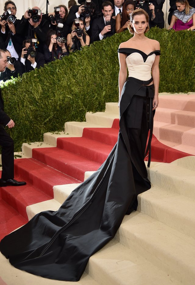
My other favorite of the evening was from an activist and actor I’ve long admired: Emma Watson. She is a crusader for equality, access to equal rights, the modern feminist movement, social and environmental responsibility, and the secret world of wizardry. And she has one hell of a style.

gettyimages-527658138
Photo: Tech Insider (Yes. Tech reporting on fashion. See, I TOLD you they’re an item!)

Watson has made an effort to represent sustainable fashion on the red carpet, sourcing most of her gowns from repurposed or responsibly-grown materials. In this case, the pants, bustier, and train are all made from spun recycled plastic bottles, and the fashion maven has promised to re-wear each item.

Watson stated, “Being able to repurpose this waste and incorporate it into my gown for the ‪#‎MetGala‬ proves the power that creativity, technology, and fashion can have by working together.” I’m not sure there’s a better summary of her interpretation of the Gala’s theme, and it’s one that many of us can (and should) embrace.

You might notice that I haven’t featured any 3D printing at this event. As far as I could tell, only Allison Williams wore something that featured that technology (the flowers on her gown were 3D printed) and the look itself was interesting but somewhat uninspired. And though my work revolves around the 3d printing world, I have taken a much more diverse interest in technology and how it relates to the fashion tree and its jewelry branch.

The failure of stylists, designers, and celebrities to commit themselves to this year’s theme was, to me, an unfortunate side effect of an industry that pays lip service to current modes but is unreliable for delivering on them. In hindsight, my enthusiasm ahead of the Gala now feels naive and not a little like wishful thinking. Perhaps in time my high hopes for jewelry and fashion will fulfill their happy ending, but for now, I’m mentally updating their relationship status: It’s Complicated.

Two Become One: Fashion and Tech are Officially an Item

**Feature image credit: Boston Globe,“Molecule” Shoe by Francis Bitonti Studio Inc., Museum of Fine Arts, Boston**


I’m on a roll with these post titles, aren’t I? Don’t clap, just throw money. I’m here all week.

Tonight is the annual Met Gala, the event of the year for all things fashion, or really just for anyone important enough to score an invite. It’s a closed event, meaning the actual goings-on are not televised for us non-famous plebeians, probably because we’d be so overwhelmed by fabulousness that the world would grind to a halt due to mass unconsciousness.

The Gala has fascinated and inspired me for many years, but only in a limited sense — it’s great fun to watch celebrities (or their stylists) interpret the theme for each year, and the inevitable hijinks make for great bubble bath reading material, but that was usually the extent of my attention span.

But this year may just prove to define the peak of a movement I’ve been watching much more closely, of late: the strange, often conflicted and sometimes transcendent relationship between technology and fashion.

Welcome to Manus x Machina: Fashion in an Age of Technology.

(I may have suffered a bit of whiplash upon first reading the announcement. My eyes snapped back to the beginning of my Google Alert sheet, where I clicked and read about 15 blurb-y articles predicting “cutting edge fashions” and “nontraditional stylings” to appear on the red carpet.)

If you consider this annual spectacular to be the epitome of taste-making, the absolute and final arbiter of all things now — and believe me, many people do — this is big news. It’s time to make is Facebook official, folks: fashion and tech are dating. Pinned. Going steady. An item.

After a recent visit to the Museum of Fine Arts exhibit #Techstyle, with its look at everything from the latest fabric innovations and designer creativity to the way people interact with style and taste, I’m convinced that this relationship has staying power. Fashion hates to stagnate, and fears becoming lost and passe in an instant-access world. Technology provides the means necessary to keep up momentum, diversifying materials and expanding the very definition of what makes fashion a product of the people who wear it.

I used to hesitate, if asked my opinion on the direction it seems both high-end and mainstream fashion are taking. It’s easier to prevaricate than commit to passing judgement on something so massive, even though I’ve been leaning towards “cautiously optimistic” for some time. It seems the Met Gala has given people like me a sense of validation, that perhaps we’re not so crazy for dreaming of a wider, more expansive approach to an industry which, in the inimitable words of Miranda Priestly, “represents millions of dollars and countless jobs” and influences our daily lives.

More than anything except perhaps music, the things we choose to adorn our bodies have the ability to define our culture. The emerging fashion designer and MIT grad are no longer on opposite sides of the fence, but might even be one in the same. I can’t wait to see what they think of next.


Stay tuned for a follow-up post, after the evening’s festivities!


Jewelry and the “F” Word: Fashion

In a conversation with a fellow industry professional last week, I made this comment about the attitudes of certain types of clientele:

“We work in fashion. Why should we expect them to treat their jewelry any differently than their shoes or handbags?”

Death stare.

“We don’t work in fashion, we sell real jewelry.” Meow.

To me, this attitude is wrong on several counts. First of all, jewelry by definition falls under the broad umbrella of fashion items, along with any other accessory or article of adornment. It’s also governed by the same basic tenets (brand focus, trend awareness, color and style aesthetic), follows seasonal cycles, and even maintains a demographic pattern heavily based in income and access. All of these are hallmarks of fashion, regardless of price point.

To say that we are an industry apart implies that our buyers are not behaving in the same way as fashion buyers, and that is simply not the case. While some would like to think that selling a person on the sentiment or investment alone will close a sale, the simple reality is this: if buyers are convinced that one is enough, then repeat business is dead in the water.

The only way to build and maintain a healthy and growing industry is to encourage the idea that no purchase need be the last. You bought a wedding band? That’s wonderful, meaningful, and special — but what about another one for the other side, say for your anniversary? I’m tickled pink that you love your favorite dress watch, but wouldn’t you like something a little more casual — but no less beautiful — to wear every day? And wouldn’t those classic diamond studs look marvelous this evening when they’re dressed up with a set of diamond and sapphire enhancers? Of course they would!

My customers don’t own one pair of shoes, one bag, or one coat (especially in New England. Come on people, we have seasons!). Leave your arguments about consumerism, conspicuous consumption, and class divisions at the door: our entire industry — beauty and yes, fashion — relies on convincing the customer that he or she should have at least one more. Ten dollars or ten thousand (ten million and up, too), there is no time for semantic distinctions between your branch of the tree and mine.


[Editorial] Dear Advertisers, Sell the “Good” Not the Goods

Thank you, marketing geniuses and PR gurus. Thank you for your creative, imaginative, catchy, pithy, poignant, colorful, and popular efforts in finding a way to sell stuff to people. You are the driving force behind the way business operates today, and the sidecar companion to consumer trends. I can’t over-state how much I appreciate the difficult tasks you’re given, and how beautifully — and often, brilliantly —  you carry them out.

However.

In receiving the credit, you are doomed to hold equal share of the blame. Consumer behavior is your wheelhouse, and it’s on your head I squarely place the blame.

In your infinite branding wisdom, you have decided which names mean quality, and which do not. You place one style above another, often at the direction of said brand, without looking at the bigger picture. You push and push for something a client asked for, without ever considering what, exactly, you’re pushing on the unsuspecting consumer.

We, the retailers, are left to deal with your mess. We spend as much time in the day correcting misconceptions and re-educating the buyers as we do actually selling our own product. We have to explain, and present, and demonstrate, and explain again why a sterling silver chain from Big Name Company is totally undifferentiated from the one I have in stock. And why a name on the box means status to you and very little to me. Why our pearls are, in fact, nicer than the ones from the guy’s name you can’t pronounce, and why that is.

Untangling your mess has become a part of my daily routine. While I consider an educated buyer a better buyer, the learning curve can be steep — and that’s only with the willing ones, those who want to get to know their purchases. The rest leave me stuck between an honesty rock and moral hard place, where I won’t bad-mouth another store but refuse to perpetuate one of their many myths, truth-stretches, or occasional outright lies. Consumers’ heads are spinning, and the consequences are lower confidence and fewer purchases.

I think it’s time for advertisers to reverse course and focus on selling what I call, simply, the good. Sell beauty, romance, hopes & dreams, a lifestyle, a destination. Sell my customers on individuality, unique style, stunning color, attainable quality, and above all, sell them value. In doing so, your rising tide will lift all boats, allowing the entire industry to reclaim its previous place as worthy of trust and esteem. The fashion world is leading the way for individualism, constantly making room for personal expression and edging away from the concept of “out vs. in” culture. Jewelry is a branch of the fashion tree — a strong one, at that — and should be following suit.

We can’t afford to encourage the widening of the luxury/disposable gap, and that’s what your offhandedly thoughtless, us-versus-them advertising copy gets us. Allow consumers to embrace an idea, not just ideology, and they will return the courtesy by trading hard-earned dollars for dream fulfillment. A diamond was once forever, and should be again.

It’s time for an update, marketing mavens. Jewelry at all levels should sell because it is desired and loved, a symbol once more of occasions, commitments, successes, and my personal favorite… just because.

Little High, Little Low

I’ve been meaning to write this post for some time, in answer to a common question I get from friends and family. They always seem curious about the jewelry I actually own and wear, bringing attention to both my personal style and my ability to function as a representative of my industry. It occasionally makes me feel like a snarky celebrity, fielding those banal “who are you wearing?” softballs tossed out to attractive starlets on crimson carpets. More often, it allows me a wide-open opportunity to introduce new styles (or old ones) to the people around me, gauging their reactions in a market research microcosm.

I would like to imagine that the visionaries behind a designer name are never caught without their style house’s brand somewhere on their person. In my mind, they live and breathe their work, incorporating it so naturally that they literally embody their brand. Those of us on the lower rungs of fashion are not so fortunate, and must be content with aping our betters until we can afford to make our own statements. But therein lies the beauty of the “high/low” concept of fashion: mixing timeless, well-made, investment pieces with on-trend and less expensive flair is nothing if not an egalitarian approach.

It’s a method I’ve adopted, and it seems to work pretty well. Wearing classic pieces most of the times means that a change makes a much bigger impact — people tend to notice. It’s easier to do more with less, which also means that every new acquisition gets its fair share of the spotlight it deserves. On the other hand, those timeless pieces have a great ROI in their lose cost-per-wear, and it’s rather nice to have a few signature things. Where would Jackie be without her sunglasses or Marilyn without her lipstick, after all.

I can honestly say that I love my brass-and-glass ear cuff, and I love my gold bangle bracelet. One will certainly won’t outlast the other, but then, likely so will the trends from which they emerged. And that’s perfectly okay with me, because it means I’ll have some lovely new trends to follow (or not), keeping my wardrobe fresh and exciting and ever-evolving. I make no apologies for mixing, even when friends ask why I’d wear something from there when I work, well, here. Besides, when I go to work inside a glittering jewelry box every day, I’m allowed encouraged to gently wear what I sell — jewelry isn’t meant to sit in a case, after all, and it always looks better on than off.

High-fashion echelon arguments to the contrary, one can posses a unique style without a wardrobe of one-of-a-kinds. This obviously applies not only to clothing, but perhaps even better to accessories of all kinds. I doubt anyone with the black quilted Chanel on her arm has had cause to regret that purchase, but perhaps the Lucite heels from a few decades ago have long since been retired. (Well, maybe they’re back out again now, but they’ve been dust-collecting for 25 years.)

So yes, I tell those who ask, I do wear the real and the “fake.” I love them both for their own unique properties, and strongly encourage people to experiment as their own tastes and budgets allow. I readily admit which pieces is which, if questioned, using the opportunity to educate and spread the good word of jewelry to all. I suppose jewelry can be like an investment, if only in this one way: diversify!

Color Me Wild (Follow-Up)

Following my previous post, it has seemed to me that articles and advertisements about color have been everywhere. This of course is very exciting to me, and likely the rest of the fashion world as well. We in the northeast have waited long enough for spring!

My family history of mild color perception issues reminded me that it was time to re-take a color test and see just where my own abilities fall. I wondered — could my self-claimed color sensitivity be wrong? Had it deteriorated with age? Myself and my co-workers had recently been discussing the test after that blue/gold dress internet debacle, so I sat down and took it again. It’s pretty neat — check it out for yourself right here.

The “best” score on this test is a 0, meaning no incorrectly placed tiles. Obviously, the higher the number, the worse the result. My very first time taking it (last month), I scored a 6 — pretty fabulous, right? I spent less than 5 minutes on it, so I wondered if I could do better. I set my phone timer for 5 minutes again, and this is what happened:

Look at that beautiful spectrum
Look at that beautiful spectrum!

Yep, that’s a perfect score. Hooray!

I’m not sure what kind of bearing this test has on my actual color detection abilities, but it certainly made me happy to know that my eyes and brain are in good shape.

As my studies in gemstones and gemology continue, I will be interested to see how this test compares to my ability to grade stones and perceive minute variations in tint. (If I were a betting woman, I’d guess that my near-perfect musical memory is linked to this as well, since I get the same sort of “feeling” of wrongness when a note is incorrect as when a color is off.) Of course, there are many factors that have a direct impact on the way we individually perceive color, including time of day, mood, current trend, and even what color clothing you’re wearing at the time.

Just think about how you feel when it’s pouring rain for three days straight, and someone walks by in a bright yellow raincoat. Now picture that same jacket on a sunny and warm day. Not nearly the same jolt of excitement, right? Context is obviously key, but it’s not limited to the person wearing the coat — you felt sad and grey in the rain, so the yellow stood out because your perception of the color was affected by your mood.

Now, I think it’s time to go shopping. I saw a lovely yellow trench just the other day…

So, tell me: did you take the color test? How did you do?

Color Me Wild: An Ode to the Bold and Bright

As a child growing up just outside of Boston, one of my favorite places to visit was the Museum of Science. What kid doesn’t love to watch lightning strike indoors, make music by walking a staircase, or explore the world of prehistoric creatures? But one of my favorite exhibits was on an upper floor down a lesser-known hallway, tucked inside an area designated for learning about the way the human body works. Anatomy and physiology were never my strong suits, but a display dedicated to color, scale, perception, and the human eye-brain function never ceased to amaze me. From optical illusions to swatch-matching, I couldn’t get enough.

(As anecdotal evidence of my passion, I memorized every color in my Crayola crayon box by age 10. How else would an elementary school student know how to spell — and pronounce — cerulean?)

It’s unsurprising, then, that I’ve always had a particular love of color and design. I tormented my own mother after discovering her partial colorblindness (just the color green, strangely enough) but redeemed myself by always helping her select coordinated outfits and even picking the paint color for my parents’ new kitchen.

It follows, then, that the study of colored gems in particular leads to a rather in-depth look at color and a specialized vocabulary not found among the crayons. Fashion and lifestyle brands are now heavily influenced by the renowned Pantone Color Institute, which both maintains accurate and reliable color swatching and attempts to predict (or rather, set) each season’s feature color and palette. This has an interesting side effect: some businesses hop aboard the trendy train, embracing each new color and promoting its use in everything from home decor to nail polish. Others will purposefully split from the popularized palettes, choosing instead to pursue a kind of counter-culture aesthetic instead.

The result of this new focus on color seems to be, primarily, a lot more of it. Wildly color-and-pattern-centric classic brands such as Vera Bradley and Lilly Pulitzer are back in the spotlight, with the latter about to debut its first mass-market collaboration with Target (the brand follows other bright and bold names such as Missoni). While monochromatic styles will likely never be a thing of the past, it does seem that more colorful plumage and the self-expression it brings has moved to the forefront.

Where does this leave me? My little Yankee heart will always have room for the classic, tailored lines of seaside, citified, prep-school standards like khaki and navy. But my lifelong appreciation for color feels right at home in an industry dedicated to the beautiful, creative combination of every color under the sun, so this little dove feels more than ready for some finer — brighter — feathers.