Missing Pieces

A colleague of mine recently posed this question to a large and varied industry group: what’s missing from today’s jewelry market?

Deceptively simple, his query struck me rather forcibly because I had just begun to write a blog post (the one you’re reading now) as a brief study in what I felt has been underrepresented or even entirely absent from mainstream jewelry.

My response was internet-appropriately brief, but in this space I thought a little more elaboration was due. We tend to think of jewelry in terms of categories, so what follows is a sort of commentary breakdown, combining some unofficial bird’s-eye-view concepts that borrow heavily from my daily work with a dash or three of personal, yes-I’m-a-Millennial-get-over-it opinions. Ahem.

Engagement/wedding: I know you love it, but the halo in all its possible iterations has been done — and done very well — to death. The style I never see is a band, thin or wide, with beautiful engraving that goes far, far beyond the vintage flowers-ropes-vines trifecta. Little or no gemstones are needed, but instead, well-executed metalwork with designs that speak to clean, bold, or even whimsical patterns are nowhere to be found.

Fashion: give me sleek, modern designs that emphasize amazing color and perhaps clean geometric patterns. Give me dark and light, negative space, comfortable, and hefty. Show off the amazingly diverse rainbow of colored gems we have available, with non-standard cuts set deep into pieces that highlight texture and celebrate something, anything, that reflects personality.

Symbolic: more like a subcategory, but the idea of talismanic jewelry has always been both appealing and relatively scarce. Sure, the average consumer often takes any special gift and turns it into a symbol (that being the point, more often than not, of giving jewelry in the first place), but I don’t often see designers inventing completely new symbols for people to use in honor or celebration of something specific. And so help me if I see one more poorly-rendered Ribbon of Whatever dangling off a charm bracelet…

Looks Custom But Isn’t: okay, I made up this category, but go with it. If more designers did what only a select few have ever done — which is to say, blasted into the stratosphere high above the comfort zone — we’d have so much more clever things to wear. You all know I’m the biggest advocate for full custom jewelry, but often it’s best to let the creative geniuses around us take the lead and make a concept come to life. Sometimes a designer has created something that is so utterly perfect, so fitting for a person, that it looks and feels like it was custom made even when it wasn’t. That’s quite an achievement.

Now, naming names isn’t normally my thing, as I don’t accept payment in any form for this blog and I strongly prefer to stay as neutral as possible. But I’ll make an exception here by listing a few designers whose work I truly admire as being some combination of unique, progressive, and striving to rise above the commonplace. In no particular order, I’ve been very interested in the following**:

— Collette, for beautiful and edgy
— Retrouvai, for bold and graphic
— Temple St. Clair, for whimsical and extravagant
— Marla Aaron, for cool and inventive
— Wendy Brandes, for modern and irreverent

These folks are doing things outside the proverbial box more often than not, and you don’t have to fall in love with every single piece to appreciate the brilliance behind much of their respective works. These designers also have individual pieces or entire lines that are wholly, uniquely their own, which means a knock-off is very easy to spot. Imitation may be a form of flattery, but it’s also horrible and illegal and I’m really sick of the design theft that often occurs when big box stores want a designer’s look without actually paying them for it. (End rant).

For the record, that’s an incredibly incomplete list. Don’t message me with any form of “but HOW could you not mention my favorite designer, XYZ?!” or even “ABC doesn’t deserve to be named!!” All designers are striving and struggling and working and shedding blood/sweat/tears/diamonds in what they do. I have many, many designer friends whose work I find incredibly appealing, but I’m not in this game for the promotional benefits. This is just an informed opinion, folks.

For consumers and industry vets alike, I would really love to know: what do you think is missing from the market? What do you want to see, or wear, or buy, or design? Please chime in here, in this openly democratic forum.

**I won’t even put a link. Check them out, or don’t.
Be Bold

The ring featured in the header image of this post is one of our most popular styles. It contains an extremely high quality custom-cut garnet and nearly 3/4 of a carat of colorless diamonds, all set in 18K rose gold. Isn’t it just stunning?

I don’t often talk about the jewelry in the pictures I post, mainly because I feel that so many other blogs and websites do a much better job detailing some of the most intricate and beautiful jewels in the world. But this particular ring, designed by a fabulous, talented, and extremely kind woman named Bellarri (yes, that’s her!), represents something just a little beyond my usual more conservative classic taste.

Raised to always be the cool, poised, and diplomatic daughter, I struggle to speak out and stand up for myself. Doing the same for others has never been an issue — a lifelong activist and advocate for equality, I’m no armchair protester — but to raise myself up to a position of power has never felt comfortable. In short, I need to learn to be bold. And this singular piece of jewelry, with its fiery center, brilliantly outlined details, and larger-than-life presence, is nothing if not bold.

It sounds silly, perhaps, to aspire to be more like a ring. But many people attempt to emulate other inanimate objects — the towering oak, the majestic mountain, the smooth ocean come to mind — so why not a gutsy fireball of a ring that practically sings out to everyone who sees it, “look! Look at me, so tastefully bold, so beautiful and bright and impossible to ignore!” You can’t pass her by, you certainly can’t pretend she doesn’t provoke some sort of reaction, and you absolutely must pay her the attention she rightly deserves. No formerly timid, currently work-in-progress leader could fail to appreciate all she represents.

Meet the Designer: Lecil Henderson

From time to time, we are fortunate enough to host the designers from some of our favorite lines here in the store. These events are very special for both our customers and for ourselves, because they allow a kind of access and interaction that’s virtually unheard of in most industries (how often did Steve Jobs personally sell an iPad?). Who better to educate us and sell the pieces than the designer himself or herself?

We recently hosted one of my favorite industry people (in general) and favorite jewelry designers (in particular): Lecil Henderson of the Henderson Collection and LUCA by Lecil. This gentleman is a well-known man about town, so to speak, and for every good reason imaginable: unfailingly polite, incredibly knowledgeable, and chock full of stories and anecdotes from his 30-year career in the business.

Lecil travels around the world bringing his designs to store events like ours, many of the largest and best trade shows, and of course he visits his factories in Italy where the pieces themselves are hand-crafted. He has an extremely loyal following, and his work exemplifies thoughtful, painstakingly-detailed design and the best quality Italian craftsmanship.

I feel extremely lucky to spend even a brief time in the presence of this guy — every time we’ve met I have learned something new about his products, design concept & inspiration, or the industry as a whole. I’m not sure I was able to express my appreciation for the time he takes to make every single person he meets feel like his closest friend, but the huge success of his beautiful pieces pretty much speaks for itself.

A few more pictures for your viewing pleasure:

Color Me Wild: An Ode to the Bold and Bright

As a child growing up just outside of Boston, one of my favorite places to visit was the Museum of Science. What kid doesn’t love to watch lightning strike indoors, make music by walking a staircase, or explore the world of prehistoric creatures? But one of my favorite exhibits was on an upper floor down a lesser-known hallway, tucked inside an area designated for learning about the way the human body works. Anatomy and physiology were never my strong suits, but a display dedicated to color, scale, perception, and the human eye-brain function never ceased to amaze me. From optical illusions to swatch-matching, I couldn’t get enough.

(As anecdotal evidence of my passion, I memorized every color in my Crayola crayon box by age 10. How else would an elementary school student know how to spell — and pronounce — cerulean?)

It’s unsurprising, then, that I’ve always had a particular love of color and design. I tormented my own mother after discovering her partial colorblindness (just the color green, strangely enough) but redeemed myself by always helping her select coordinated outfits and even picking the paint color for my parents’ new kitchen.

It follows, then, that the study of colored gems in particular leads to a rather in-depth look at color and a specialized vocabulary not found among the crayons. Fashion and lifestyle brands are now heavily influenced by the renowned Pantone Color Institute, which both maintains accurate and reliable color swatching and attempts to predict (or rather, set) each season’s feature color and palette. This has an interesting side effect: some businesses hop aboard the trendy train, embracing each new color and promoting its use in everything from home decor to nail polish. Others will purposefully split from the popularized palettes, choosing instead to pursue a kind of counter-culture aesthetic instead.

The result of this new focus on color seems to be, primarily, a lot more of it. Wildly color-and-pattern-centric classic brands such as Vera Bradley and Lilly Pulitzer are back in the spotlight, with the latter about to debut its first mass-market collaboration with Target (the brand follows other bright and bold names such as Missoni). While monochromatic styles will likely never be a thing of the past, it does seem that more colorful plumage and the self-expression it brings has moved to the forefront.

Where does this leave me? My little Yankee heart will always have room for the classic, tailored lines of seaside, citified, prep-school standards like khaki and navy. But my lifelong appreciation for color feels right at home in an industry dedicated to the beautiful, creative combination of every color under the sun, so this little dove feels more than ready for some finer — brighter — feathers.

Hot Off the Bench

I think it’s time for a new serial feature, don’t you?

Conveniently, our fabulous goldsmith has come up with a little project to work on, and I thought it would be a great way to show how some types of custom jewelry come to life.

This time we’re starting the process by selecting gemstones and designing a piece around them. It’s often fascinating to consider how different people approach the same materials, and probably says a lot about each unique personality and taste.

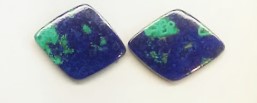
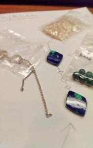
In my case, I’ve selected this Azurite & Malachite pair to play with:

Azurite & Malachite diamond-shape doublet pair
Azurite & Malachite diamond-shape doublet pair. Pretty, huh?

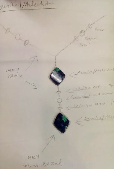
At first glance, the mind goes immediately to a pair of earrings. Dangles perhaps, with a simple wire wrap and lever back. But the more I toyed with the idea, the less I liked it — the object of this lesson was to create something I might actually wear, and earrings weren’t ringing any of my bells. Instead, I picked up a pencil and started doodling a necklace, something casual to wear in those warmer months the meteorologists insist will come.

The deep blue and vibrant green with globe-like land and sea contrast cried out for a more organic accent, so I began to toy with freshwater pearls, various chains, and other elements to create a simple but laid-back (and just a little coy) Y-necklace design.

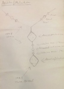
Original sketch -- basic concept, a few notes on possible metals and accents
Original sketch — basic concept, a few notes on possible metals and accents
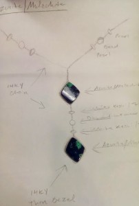
Orientation and placement of stones
Sample materials, including chain, pearls, and some malachite beads

At this point, it’s time for a discussion about materials, structure, logistics, and of course the total cost (design, materials, labor). We’ll be looking at the practical execution of a general idea, and hopefully resolve any potential issues during the actual design process. Will the Y be too heavy? Are the beads and chain in the right proportions? How does the necklace lie on the neck, and how do we prevent issues like spinning? What kind of clasp is best? How long should the Y-portion be?

The logistics can be overwhelming at first, but a methodical approach and talented, experienced goldsmith are the keys to figuring out the best way to achieve a beautiful end result.

Stay tuned to see how these component parts come together as a whole, finished piece of wearable artwork!