The Serpent of Serendipity

I have always wanted a snake ring. <—Not a weird statement from a jewelry person.

The industry is full of them: classic Bvlgari, modern Temple St. Clair, biker-chic silver, antique 10k embossed motifs.

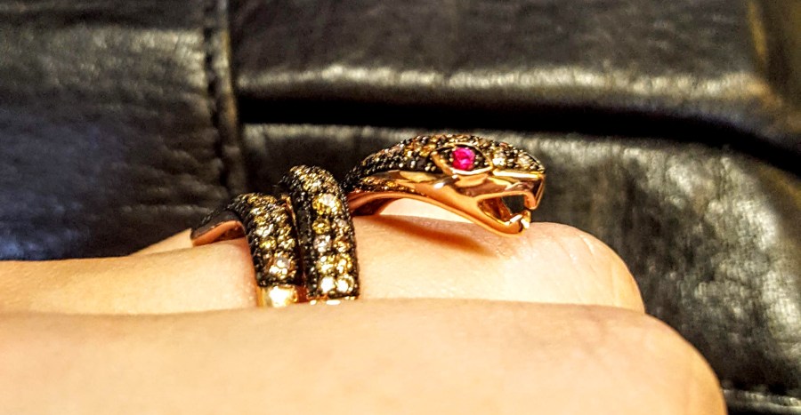
Over the years I’ve seen my fair share and coveted a few, but none of them have ever been quite right for me.

Why a snake, you ask? Throughout history, the serpent has been a symbol of transformation. It is often used to represent passion and rebirth, a story of life and death wrapped in a mythical creature who stands as a guardian of the sacred and oracle of cunning, wisdom, and healing. Found in history from alchemy to modern medicine and recorded in almost every culture ever to exist, this deadly and delightful animal winds its way into the subconscious the way a living version curls around a branch.

While I’ve never been interested in snakes as pets or guests in my sleeping bag, they have an undeniable power to fascinate (or enthrall – I’m not-looking at you, Kaa of the Jungle Book). It’s easy to see why they’ve been a successful adornment motif since the days of Cleopatra or long before.

So last month, as I acknowledged the first official anniversary of the closure to my very difficult year, it shouldn’t have been a surprise to stumble upon a new little friend.

Found in the course of my day-to-day work activities, this piece smiled up at me and asked to be saved from the rather final fate of the fires (um, literally). It needed some TLC. It called to me, and at just exactly the perfect time to commemorate my own rebirth of sorts, it was ready.

_____

It’s easy to get lost in the daily drudgery of work and life. While I spend my days surrounded by things that many people covet, I sometimes forget that a piece of jewelry represents (at its best) less of a “thing” and more of a moment, a feeling, a milestone.

The joy that this acquisition has brought me far outstrips its monetary value, and perhaps that’s the final lesson it needed to impart: after all the numbers and analytics, remember to treasure the memories.

I’ve laughingly called it my “divorce ring,” but perhaps the better moniker is the Transformation Ring. The symbolism – and of course the ring – just fits.

Be Bold

The ring featured in the header image of this post is one of our most popular styles. It contains an extremely high quality custom-cut garnet and nearly 3/4 of a carat of colorless diamonds, all set in 18K rose gold. Isn’t it just stunning?

I don’t often talk about the jewelry in the pictures I post, mainly because I feel that so many other blogs and websites do a much better job detailing some of the most intricate and beautiful jewels in the world. But this particular ring, designed by a fabulous, talented, and extremely kind woman named Bellarri (yes, that’s her!), represents something just a little beyond my usual more conservative classic taste.

Raised to always be the cool, poised, and diplomatic daughter, I struggle to speak out and stand up for myself. Doing the same for others has never been an issue — a lifelong activist and advocate for equality, I’m no armchair protester — but to raise myself up to a position of power has never felt comfortable. In short, I need to learn to be bold. And this singular piece of jewelry, with its fiery center, brilliantly outlined details, and larger-than-life presence, is nothing if not bold.

It sounds silly, perhaps, to aspire to be more like a ring. But many people attempt to emulate other inanimate objects — the towering oak, the majestic mountain, the smooth ocean come to mind — so why not a gutsy fireball of a ring that practically sings out to everyone who sees it, “look! Look at me, so tastefully bold, so beautiful and bright and impossible to ignore!” You can’t pass her by, you certainly can’t pretend she doesn’t provoke some sort of reaction, and you absolutely must pay her the attention she rightly deserves. No formerly timid, currently work-in-progress leader could fail to appreciate all she represents.

Color Me Wild: An Ode to the Bold and Bright

As a child growing up just outside of Boston, one of my favorite places to visit was the Museum of Science. What kid doesn’t love to watch lightning strike indoors, make music by walking a staircase, or explore the world of prehistoric creatures? But one of my favorite exhibits was on an upper floor down a lesser-known hallway, tucked inside an area designated for learning about the way the human body works. Anatomy and physiology were never my strong suits, but a display dedicated to color, scale, perception, and the human eye-brain function never ceased to amaze me. From optical illusions to swatch-matching, I couldn’t get enough.

(As anecdotal evidence of my passion, I memorized every color in my Crayola crayon box by age 10. How else would an elementary school student know how to spell — and pronounce — cerulean?)

It’s unsurprising, then, that I’ve always had a particular love of color and design. I tormented my own mother after discovering her partial colorblindness (just the color green, strangely enough) but redeemed myself by always helping her select coordinated outfits and even picking the paint color for my parents’ new kitchen.

It follows, then, that the study of colored gems in particular leads to a rather in-depth look at color and a specialized vocabulary not found among the crayons. Fashion and lifestyle brands are now heavily influenced by the renowned Pantone Color Institute, which both maintains accurate and reliable color swatching and attempts to predict (or rather, set) each season’s feature color and palette. This has an interesting side effect: some businesses hop aboard the trendy train, embracing each new color and promoting its use in everything from home decor to nail polish. Others will purposefully split from the popularized palettes, choosing instead to pursue a kind of counter-culture aesthetic instead.

The result of this new focus on color seems to be, primarily, a lot more of it. Wildly color-and-pattern-centric classic brands such as Vera Bradley and Lilly Pulitzer are back in the spotlight, with the latter about to debut its first mass-market collaboration with Target (the brand follows other bright and bold names such as Missoni). While monochromatic styles will likely never be a thing of the past, it does seem that more colorful plumage and the self-expression it brings has moved to the forefront.

Where does this leave me? My little Yankee heart will always have room for the classic, tailored lines of seaside, citified, prep-school standards like khaki and navy. But my lifelong appreciation for color feels right at home in an industry dedicated to the beautiful, creative combination of every color under the sun, so this little dove feels more than ready for some finer — brighter — feathers.